Design Santa Barbara
Design Santa Barbara Featuring Santa Barbara City College Interior Design Students with Michael Kourosh.

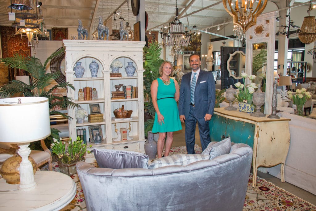
For the Design Showcase she decided to tackle a French country style sitting room after being inspired by a beautiful floral rug designed by Michael Kourosh at Design Santa Barbara.
Client Vignette
My client Ann dreams of moving to the French countryside when she retires. She travels to France whenever she is able and has many treasures she has brought back from her trips. In the meantime, she wants to create a retreat to remind her of all the things she loves about rural France in her own home and her sun room provided the perfect landscape to do this. For Ann’s French Country sitting room the rug I chose really sets the tone for the room. It has a beautiful floral pattern in jewel tones that reflects nature and helps to blur the boundaries between indoors and out which is a hallmark of this design.
A double arch bookcase in a warm cream color is a centerpiece of the room, ideal for this style that prefers warm whites. particularly like the sunburst design on this one. In front of the mirror I placed a stunning Ombre cabinet. The bow front, serpentine legs, distressed cream finish and even the small gold details are all very French.
The Room
The room quickly took on a very cozy and intimate feel with the addition of seating on the remaining two sides. I used two cane upholstered armchairs, and they are the only matching pieces in the room. This style is all about mixing, not matching. In between I placed a garden stool to act as a side table, and garden stools are great because they can also double as seating if needed.
I have a round distressed end table which I placed between my chairs and the shapely velvet settee. The blue grey of the settee is a really pretty muted tone. I like that it adds some color while still playing very neutral, and it even matches the blue in the carpet border. In front of the settee I’ve used an ottoman instead of a coffee table to better fit the scale of the space, so you can put a decorative tray on it, or use it as a footstool or seat, whatever you need at the time.
Accessories
Accessories really help the design come together. Little details are so important to making a room feel inviting. The bookcases are filled with an eclectic collection of my client’s favorite novels as well as beautiful pottery and cherished objects. One of the things I’ve done is use some unexpected objects as bookends, like the paisley jars and peacocks and by giving some of these items a purpose we keep it from looking too knick-knacky. On the top I have horse figurines, repeating the blue/gray color we saw in the settee. Having something on top of the cabinet helps to pull the eye upward which can help a space feel bigger, and they are very pastoral. On the Ombre Cabinet I’ve added some finials and flowers.
Vignette by Elise Greganti
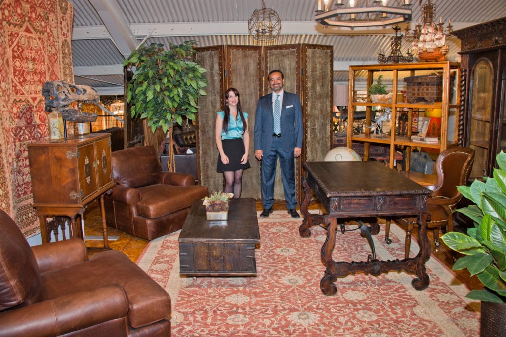
Elise Greganti chose to do a old fashion office vignette that her client Robert an anthology wanted a warm cozy space to do work from home and be able to have visitors feel welcomed and comfortable. In addition, also incorporated a tradition rug to match the traditional room setting with its red tones it brought the room together and all the colors.
Jory’s Vignette

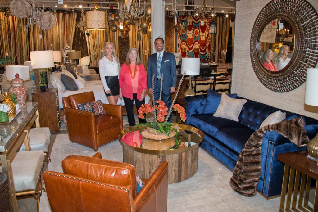
My inspiration for my vignette was to create a transitional style space that is an especially inviting place for family to gather. Growing up I spent a lot of time with my family, so I wanted this family/living room to promote time together in a well designed and attractive setting. I chose fabrics and finishes that really invoke a sense of warmth in this room. Your grandfather will enjoy a cup of coffee in his classic leather chair; your mother can read a good book on the luxurious sofa; the kids will play video games on the edge of their seats and the parents can enjoy a glass of wine around the table. In conclusion, this space is really a gathering place for the whole family to enjoy, with elements that appeal to everyone.


